top of page

by SFIC Institute

Project Showcases
See How Momentum Strategies Delivers Visual Impact Across Every Brief
People Profilers
People Profilers is a Singapore-based HR and recruitment agency with over 15 years of experience connecting talent with businesses across more than 10 countries. With a candidate pool of over 5,000 and a client base of 3,500+, they offer a full suite of HR services — from general recruitment and executive search to payroll outsourcing and employer of record solutions — all built around the belief that the right person in the right role can change everything.

The Problem
People Profilers had a solid brand and a clear sense of who they were, but their website wasn't keeping up. The existing design — built around a blue and yellow palette — felt dated and didn't carry the energy or professionalism of a company operating at their scale. The visual language was inconsistent, the layout made it difficult for both candidates and employers to find what they needed quickly, and the overall feel didn't reflect the human, growth-focused agency they had become.
_edited.jpg)
People Profilers Previous Website

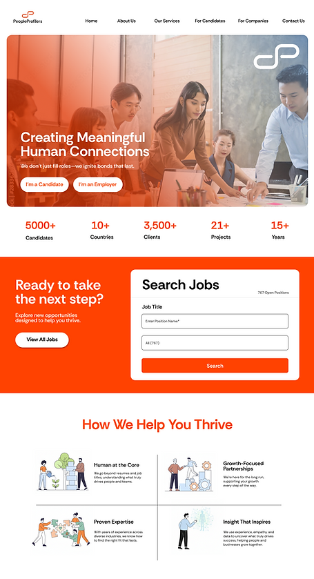
Our Design for People Profilers
The Solution
A website revamp and a fresh colour direction — bringing People Profilers' digital presence fully in line with where the brand is headed. People Profilers already had a brand guide in place, so our focus was on translating that identity into a website experience that actually worked for their two core audiences: candidates looking for their next role, and employers looking to build their next team. Alongside the website, we also refreshed the colour direction, moving away from the original blue and yellow toward a confident orange and white palette that feels warmer, more energetic, and better suited to a brand that leads with people and possibility.
Website Revamp Mockups
People Profilers already had a brand guide in place, so our focus was entirely on translating that identity into a website experience that worked harder for their two core audiences: candidates and employers. Rather than treating the revamp as a cosmetic refresh, we approached it as a structural rethink — designing clear, separate journeys for each audience so that neither group had to work to find what they needed.
Mockup #1

Mockup #2
Final Website Design
The overall design direction leaned into warmth and energy, pairing bold typography with confident use of the new orange palette to give the site a sense of momentum that matched the brand's people-first ethos. Credibility was built into the layout deliberately — surfacing key metrics early, leading with human imagery, and grounding the brand's value proposition in language that resonates with real candidates and real hiring managers rather than generic recruitment copy. Every design decision was made with one question in mind: does this make it easier for the right person to take the next step?


People Profilers
Connecting the right people, starting with the right design.
From colour direction to site structure, every touchpoint was redesigned to reflect the warmth, credibility, and energy of an agency that has spent 15 years putting people first — giving both candidates and employers a clear, confident path forward.
bottom of page